Introduction
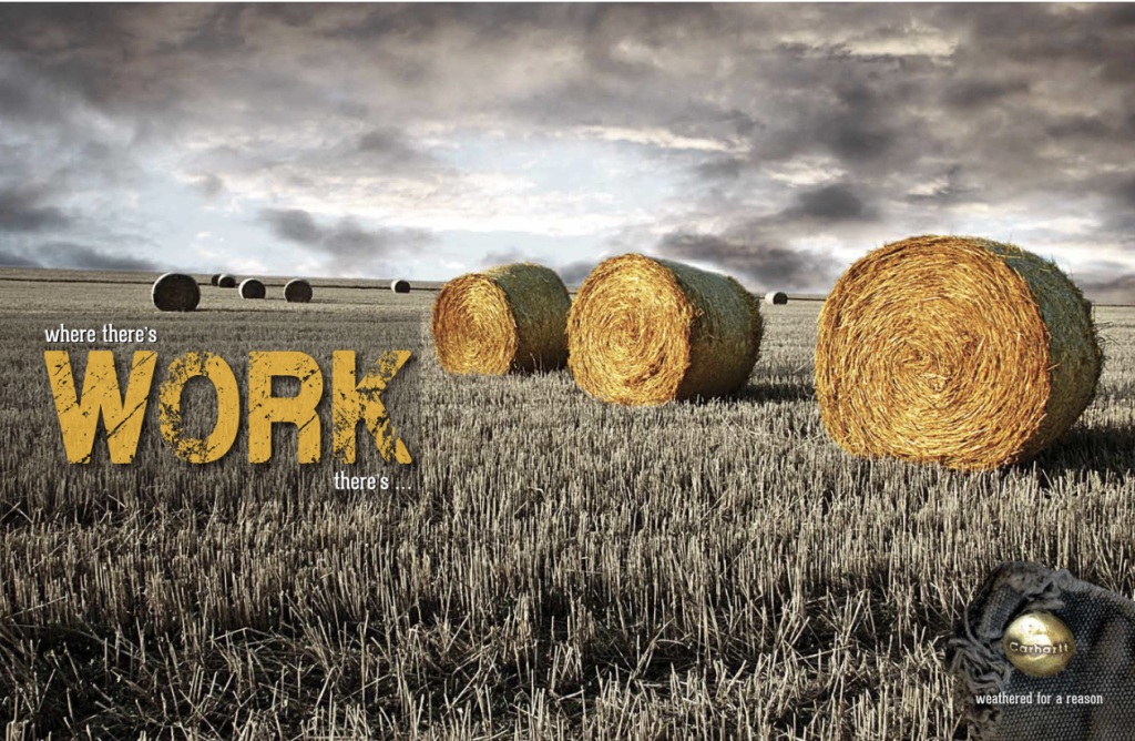
This work of art advertises this products rugged yet durability for the hard working individuals through the imagery of farming. Then, instead of using the actual logo, this artist uniquely shows a portion of the vestment, containing the company name, via the button on the bottom right corner.
Design
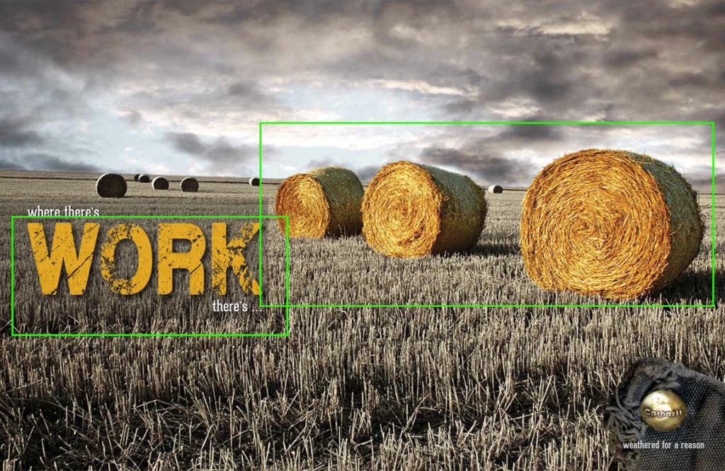
The artist does an excellent job showcasing this design through the proximity of the rugged letters of WORK and the bales of straw showing how the word “work” and the hay correspond to one another.
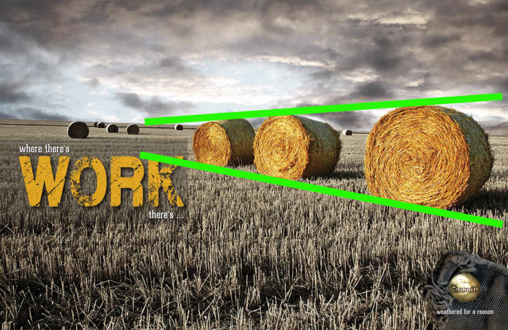
We can also see how the eye is drawn to the tapered, leading lines and as it almost points us towards the word work, pulling the attention of the viewer to where the focus is.
Color
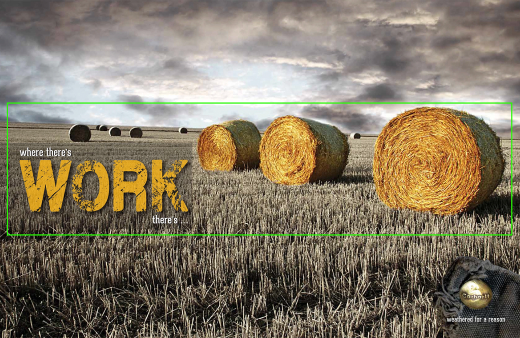
It’s easy to see how the colors are similar enough to help the viewer to recognize they are related. The background is beautifully muted of color as well as extra black clouds brought in and brought low to help darken the sky and keep the focus in the center of the image where the saturation of the bales is increased, making the colors of the bales and words feel interchangeable.
Typography
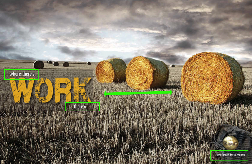
The typography in the headline caption as well as the caption below the button is the same which helps the viewer recognize they correlate to one another. The font of the word “work” looks rugid and a bit worn helping it feel it relates to the hard work of the image as well as being a bit worn like the material around the button.
My Design
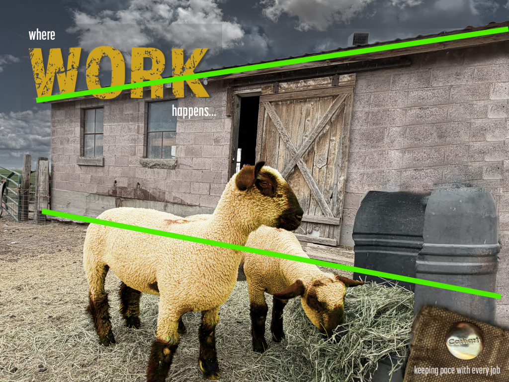
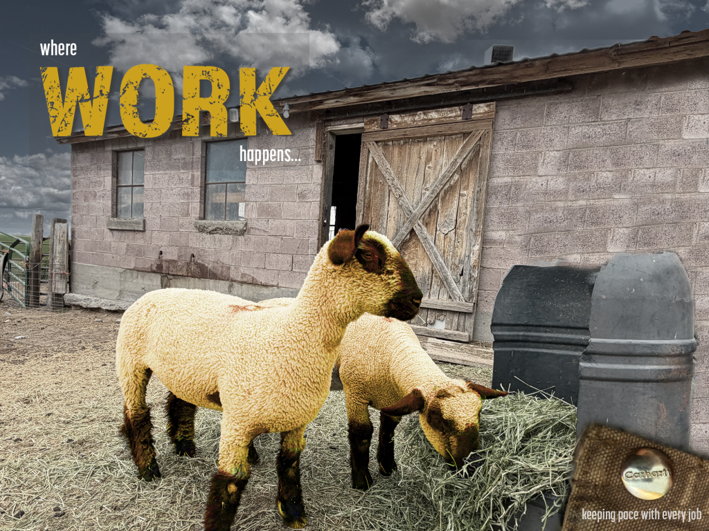
My creation uses leading lines which also draw the attention of the viewer towards the headline as well as uses proximity to help the viewer feel that there is hard work associated with the sheep.
Color
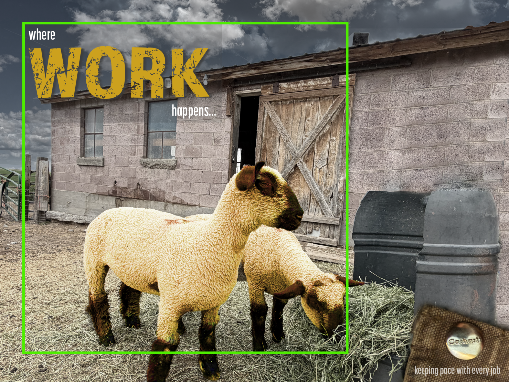
Trying to tie in the color here was a little harder than a bale of straw since yellow hues on sheep isn’t appealing. I did adjust the hue and saturation so the sheep appear more yellow than they actually are and darkened the hue of the barn and sky images to make them more muted and so they better blend into the background, keeping the focus on the sheep and heading.
Typography
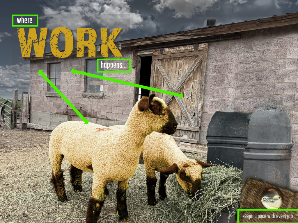
Keeping the typography similar to the original was harder since I couldn’t quite find the same font for the word “work” as the original ad had, but, I was able to find a similar sans serif font which is narrow but still rugged enough to align with the rugged background of the image of the sheep. I used a simple, narrow serif font in both the heading lines and the line below the “logo” button which tied in both fonts helping the viewer to correlate both the logo and heading while the rugged font of work helps draw similarities to work and the word work.
Conclusion
This was a fun activity to try and make a similar ad to the one Amy created. This project had it challenges and took time to figure out how to adjust the images in photoshop so I could have things like darker clouds with the lighter, and for that matter removing the original sky, which was solid gray at the time I took the photo, so I could add another image behind with big fluffy clouds. Clouds are rare here so I wasn’t able to come up with as many variations to add for darker gray ones but I did add some darker ones too. The Carhartt button I took the picture of wasn’t nearly as rugged as the one in the original ad but it was fun to try and come up with similar items and then to find ways to fade, blend, contrast and tweak in ways that make the image more than just a picture of sheep by an old barn. The typography was the easiest part of this project but still had it’s challenges. This project was fun because it made me really think and pay attention to details like the shadows behind the word “work” and going back and rewatching videos to remember how we were taught to create those but it was also rewarding to see I could come up with something different but with similar that could actually be used.
That being said, while each ad is very different they have similarities and both draw the attention of the viewer to the words and focus of the image as well as use proximity, color and typography to help the viewer correlate to the words with the images.

Leave a Reply