Category: Design & Color – Reverse Engineer Post

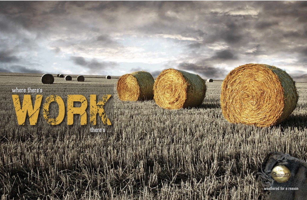
  • Where there’s work, there’s Carhartt

    This promethean ad, designed by Amy L. Johnson, exhibits her creativity with visualizing the hard earned end product and connects the image via a secondary image showcasing a tattered iconic button in place of their logo .

    Introduction

    This work of art advertises this products rugged yet durability for the hard working individuals through the imagery of farming. Then, instead of using the actual logo, this artist uniquely shows a portion of the vestment, containing the company name, via the button on the bottom right corner.

    Design
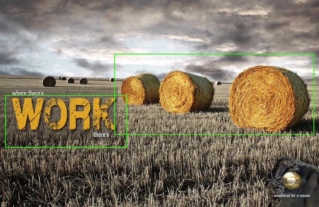
    The artist does an excellent job showcasing this design through the proximity of the rugged letters of WORK and the bales of straw showing how the word “work” and the hay correspond to one another.
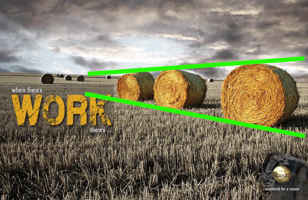
    We can also see how the eye is drawn to the tapered, leading lines and as it almost points us towards the word work, pulling the attention of the viewer to where the focus is.

    Color
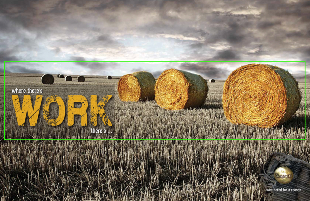
    It’s easy to see how the colors are similar enough to help the viewer to recognize they are related. The background is beautifully muted of color as well as extra black clouds brought in and brought low to help darken the sky and keep the focus in the center of the image where the saturation of the bales is increased, making the colors of the bales and words feel interchangeable.

    Typography
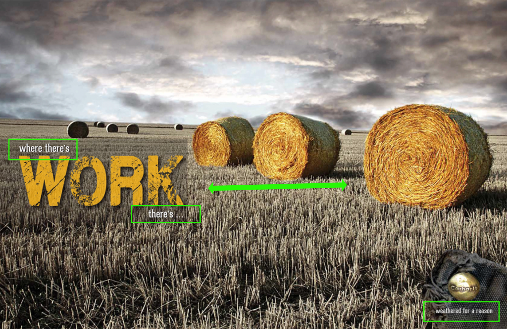
    The typography in the headline caption as well as the caption below the button is the same which helps the viewer recognize they correlate to one another. The font of the word “work” looks rugid and a bit worn helping it feel it relates to the hard work of the image as well as being a bit worn like the material around the button.

    My Design
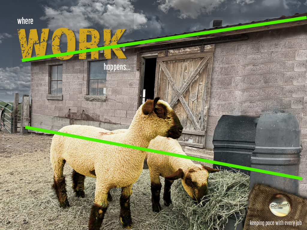
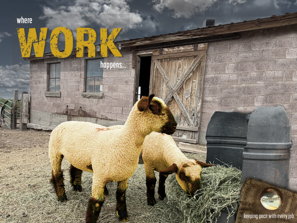
    My creation uses leading lines which also draw the attention of the viewer towards the headline as well as uses proximity to help the viewer feel that there is hard work associated with the sheep.

    Color
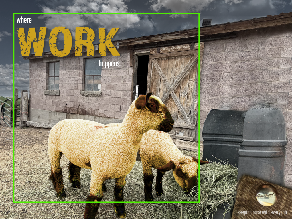
    Trying to tie in the color here was a little harder than a bale of straw since yellow hues on sheep isn’t appealing. I did adjust the hue and saturation so the sheep appear more yellow than they actually are and darkened the hue of the barn and sky images to make them more muted and so they better blend into the background, keeping the focus on the sheep and heading.

    Typography
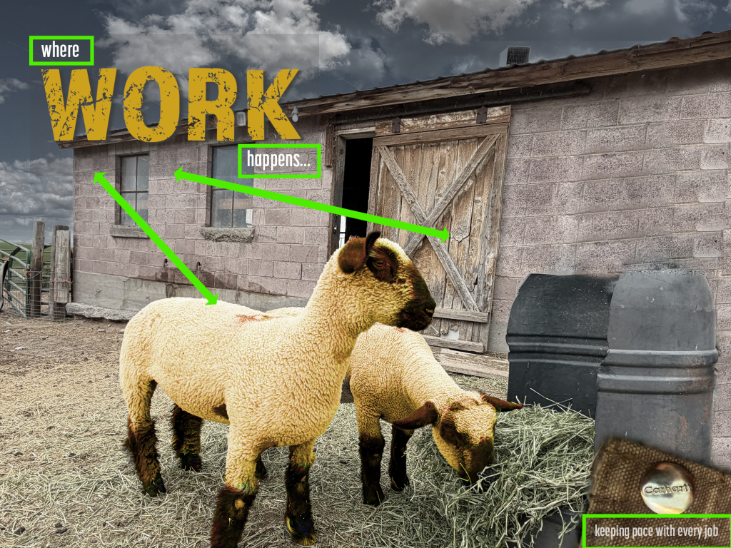
    Keeping the typography similar to the original was harder since I couldn’t quite find the same font for the word “work” as the original ad had, but, I was able to find a similar sans serif font which is narrow but still rugged enough to align with the rugged background of the image of the sheep. I used a simple, narrow serif font in both the heading lines and the line below the “logo” button which tied in both fonts helping the viewer to correlate both the logo and heading while the rugged font of work helps draw similarities to work and the word work.

    Conclusion

    This was a fun activity to try and make a similar ad to the one Amy created. This project had it challenges and took time to figure out how to adjust the images in photoshop so I could have things like darker clouds with the lighter, and for that matter removing the original sky, which was solid gray at the time I took the photo, so I could add another image behind with big fluffy clouds. Clouds are rare here so I wasn’t able to come up with as many variations to add for darker gray ones but I did add some darker ones too. The Carhartt button I took the picture of wasn’t nearly as rugged as the one in the original ad but it was fun to try and come up with similar items and then to find ways to fade, blend, contrast and tweak in ways that make the image more than just a picture of sheep by an old barn. The typography was the easiest part of this project but still had it’s challenges. This project was fun because it made me really think and pay attention to details like the shadows behind the word “work” and going back and rewatching videos to remember how we were taught to create those but it was also rewarding to see I could come up with something different but with similar that could actually be used.

    That being said, while each ad is very different they have similarities and both draw the attention of the viewer to the words and focus of the image as well as use proximity, color and typography to help the viewer correlate to the words with the images.
  • Small in size: Big in Agriculture

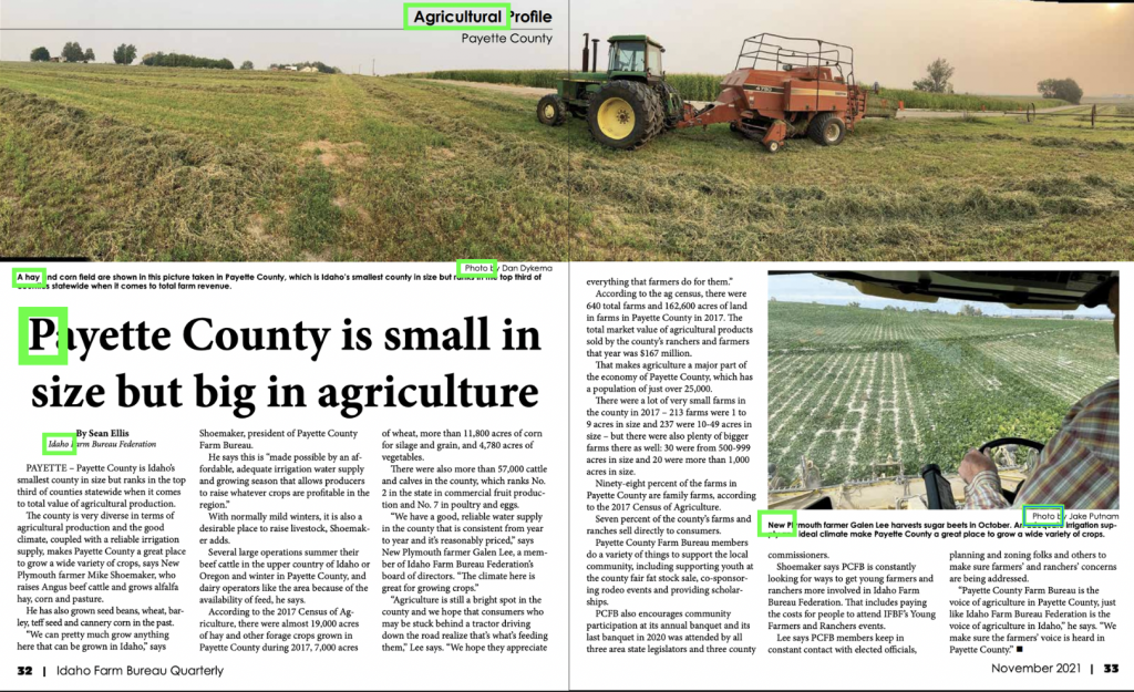
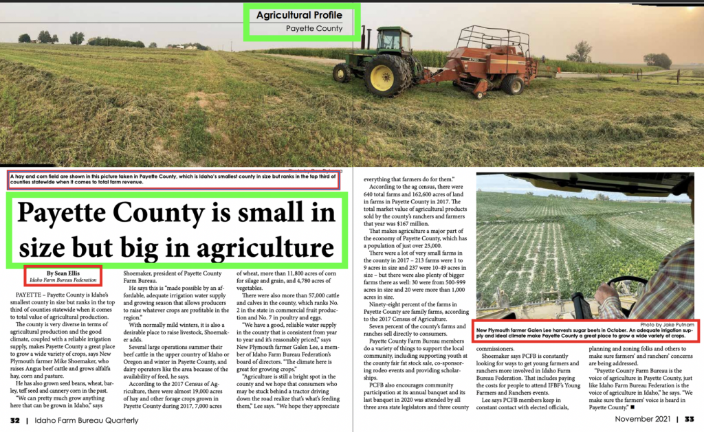
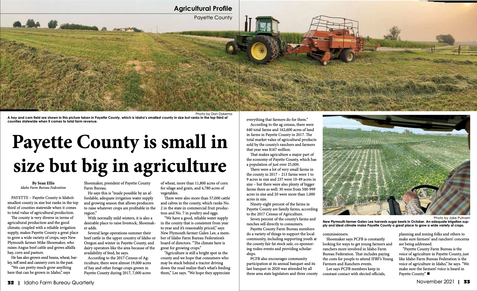
    This local news article, written by Sean Ellis and photos taken by Jake Putnam, highlights a small, rural county in Idaho while also underscoring the impact it has on agronomics.

    Typeface

    The contrasting typeface employed here furnish greater distinction between the varying captions by using a sans-serif type font; and the actual heading and body font, which are easy-to-read-in-print: serif font. The originator expertly pairs the serif fonts as both header and body font but creates a bolder and larger font for the header, bringing out the strong differences in these sections while distinctly expressing the differences between taglines and credits via using simple sans-serif and italicize sans-serif for this article.

    Contrasting Elements

    The bold, large header of this article immediately draw the eye against the smaller font of the body. There is great contrast where the photo captions are in a simple sans-serif but in bold and the credits are in a larger but lighter font weight or italics which and helps to draw the eye to those areas as different but also contrasting to the rest of the body text.

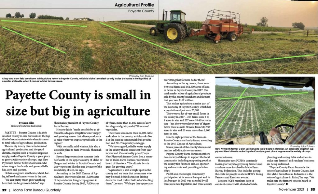
    Leading Lines

    Putnam utilizes straight or leading lines of both the row crop and the windrows, boldly showing contrast against the surrounding vegetation and pulling the viewers attention to the stark lines all while utilizing depth where he takes one picture looking up a hill and the other one looking down at the field from the cab of a swather, allowing the image to contrast with differing angles and giving a better perspective of the straight lines of these crops.

    Photography

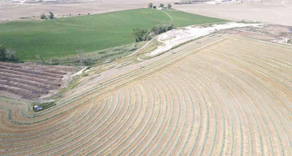
    Here are three images which could be used in place of the photos of the above article. Each of these images using differing depth and leading lines which are striking and capture the attention of the viewer.

    Conclusion

    The first image gives a drone view of the distinct leading lines of the downed field with it’s windrows arching against the strait lines of both the outside round of the field and the surrounding fields and their straight lines.

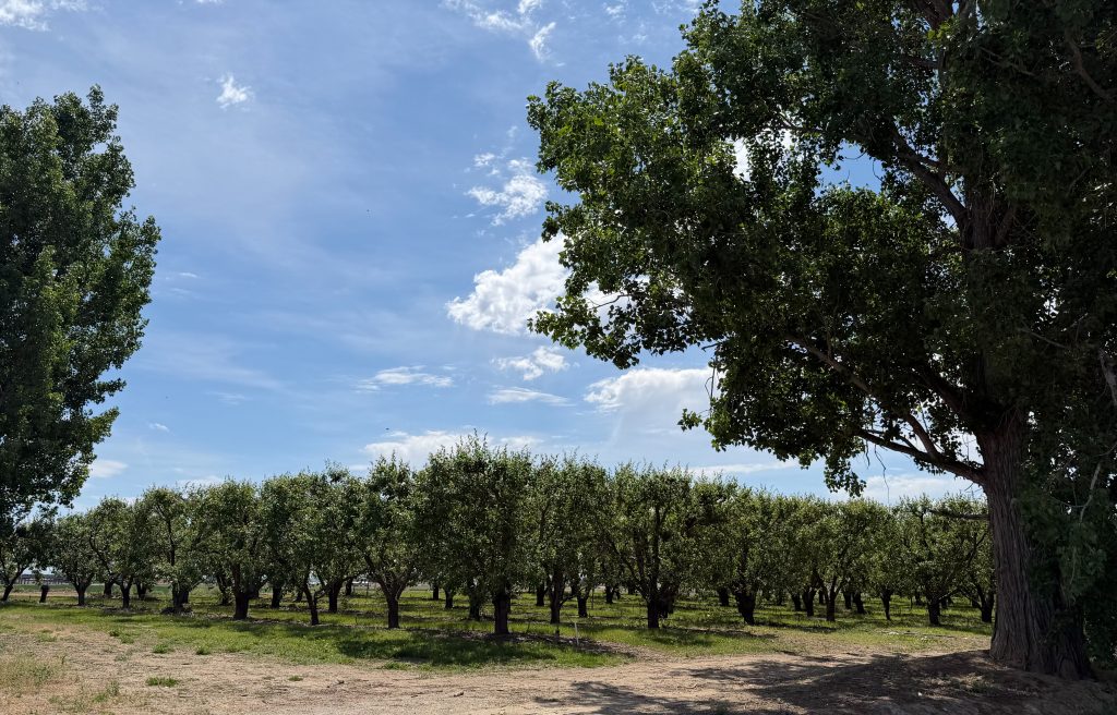
    This apple orchard is offset by two large cottonwoods on either side and the leading lines, while more subtle are the straight rows the orchard is planted in and which come to a distinct point. They are emphasized by the road on either side of the grove, framed by the trees on either side.

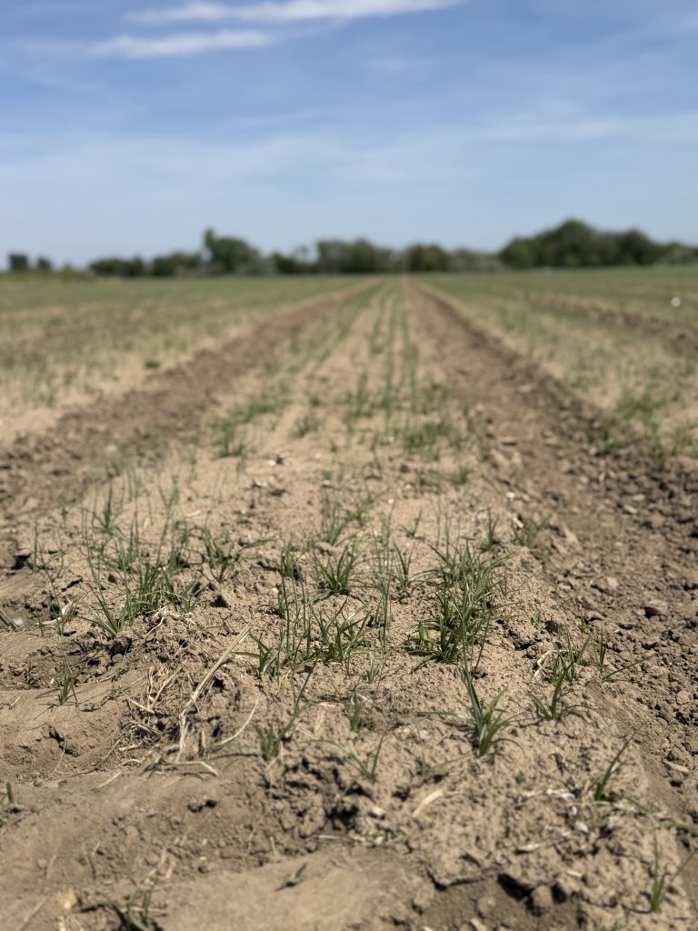
    Lastly, we have a field which is planted in straight rows and the tree-laden horizon behind the field, giving us the opposing leading-lines bringing the row crop into focus at the bottom-center of the photo.

    Each of these images contribute to the over-all-design of a small agricultural area that thrives on a diversity of agronomics, helping to sustain the world.

  • Open Late: McDonalds

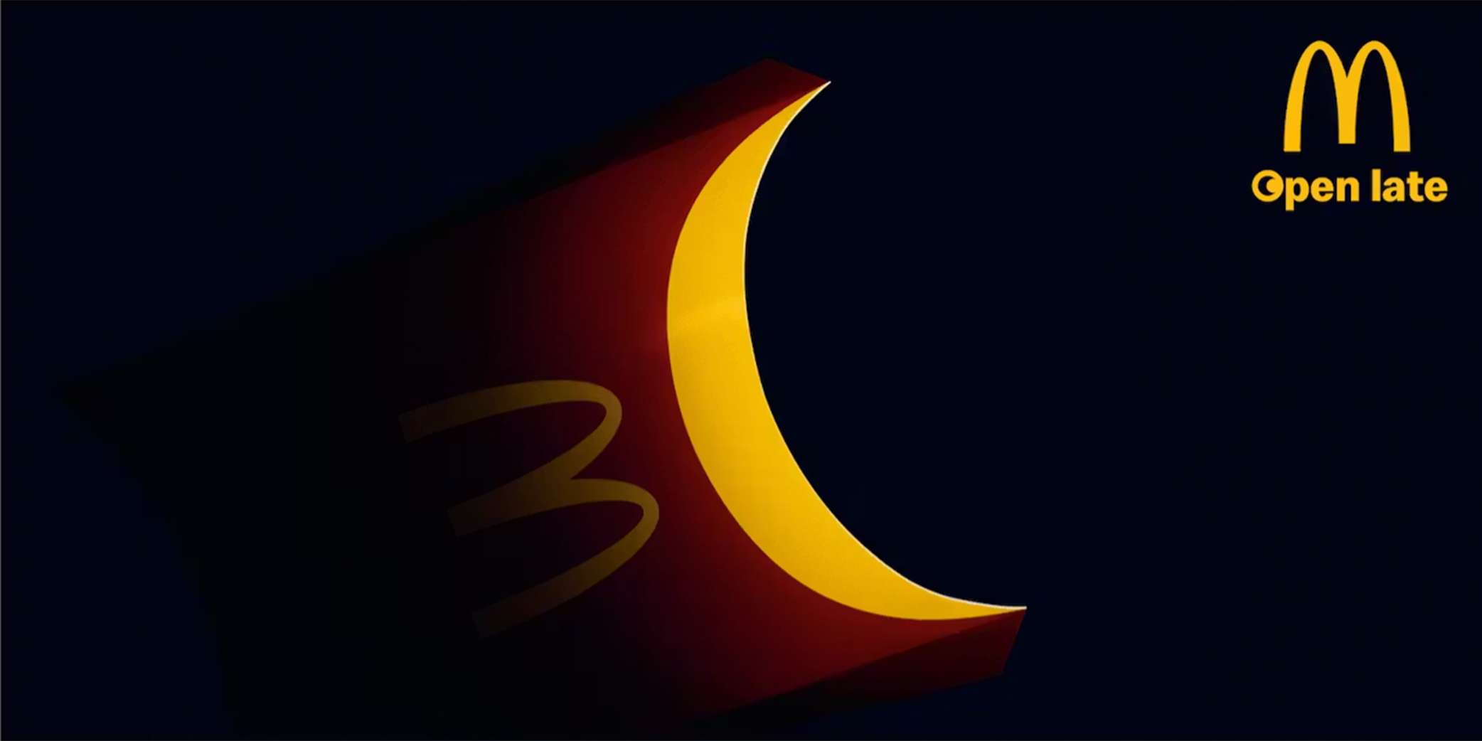
    Open late ad by Leo Burnett created in 2020 for McDonalds in Italy

    This visually striking advertisement for McDonalds, created by Leo Burnett, promotes their late-night service using a minimalistic design. This ad transforms a familiar product – the fries container – into a crescent moon, strengthening the “open late” message without relying on extensive text.

    Alignment and Proximity

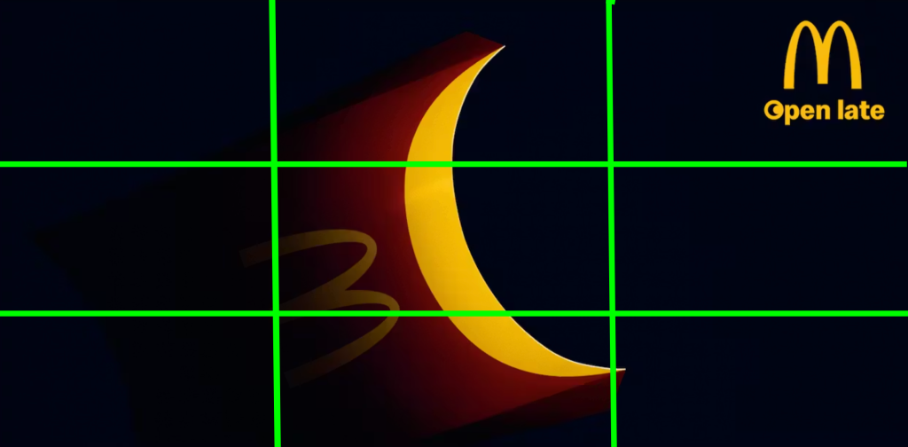
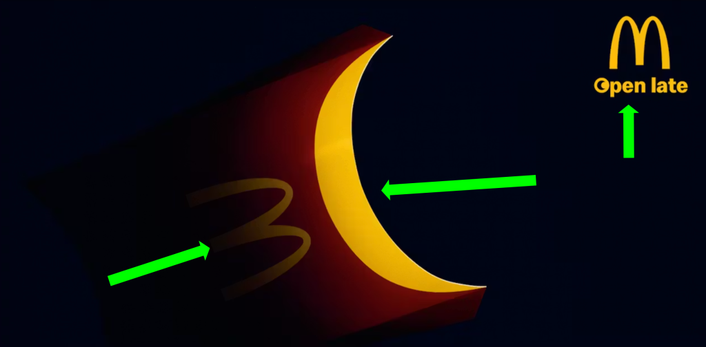
    Open late image showing alignment
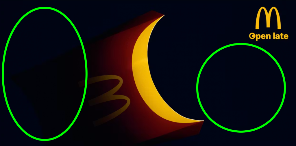
    open late ad with arrows showing proximity

    The crescent-shaped fries container is centrally positioned, acting as the primary focal point due to it’s size and brightness. Secondary alignment directs attention to the top-right corner, where the McDonald’s logo and the phrase “open late” are grouped. This placement shows both a centered and right alignment.

    It also shows proximity of the logo with the main image, reinforcing that they function as a unified message. Meanwhile, the subtle placement of the “M” on the carton visually connects the product to the brand, encouraging viewers to associate the central image with McDonald’s without additional explanation.

    Color and White Space

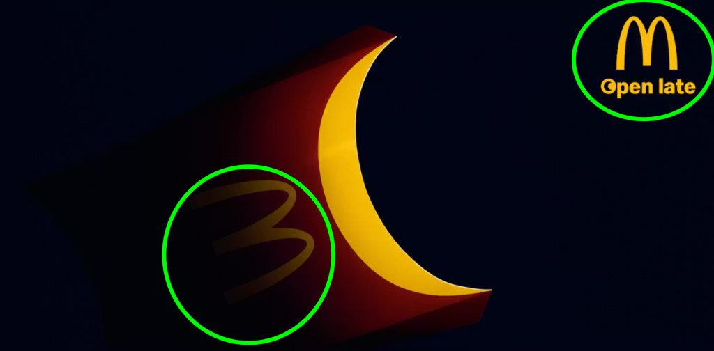
    Open late ad with arrows showing color

    The ad uses a highly effective color palette built around contrast. The bold use of golden McDonalds-yellow against the deep black background, immediately captures the attention. The contrast not only enhances visibility but also reinforces brand recognition.

    The good use of negative or white space is equally important. The dark, empty background isolates the central image, preventing distraction and allowing the viewer to focus entirely on the visual metaphor. This minimalism strengthens the message, demonstrating that the concept can be communicated without heavy reliance on text.

    Font and Repetition

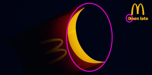
    Late night ad showing similar fonts

    The consistent typography used here, reinforces the brand identity. The McDonald’s logo, including the iconic “M” appears both on the fry container and in the logo, creating a visual repetition that strengthens recognition. The “open late” text uses a clean, simple style that aligns with the brand’s established visual language, ensuring clarity. This consistency in typography allows viewers to quickly identify the advertisement as belonging to McDonald’s without needing additional explanation.

    The design uses repetition through the crescent shape, which appears both as the central focal point of the fries container and within the “O” of the word “open”. This visual echo creates a direct connection between the image and the text, reinforcing the late-night theme. By repeating this curve, the designer guides the viewer to associate the moon-like shape with the message. This is a great example of how repetition reinforces the connection.

    Conclusion

    This advertisement successfully applies key principles of graphic design to effectively communicate it’s message. The simple design and message captures the attention and conveys meaning almost instantly.