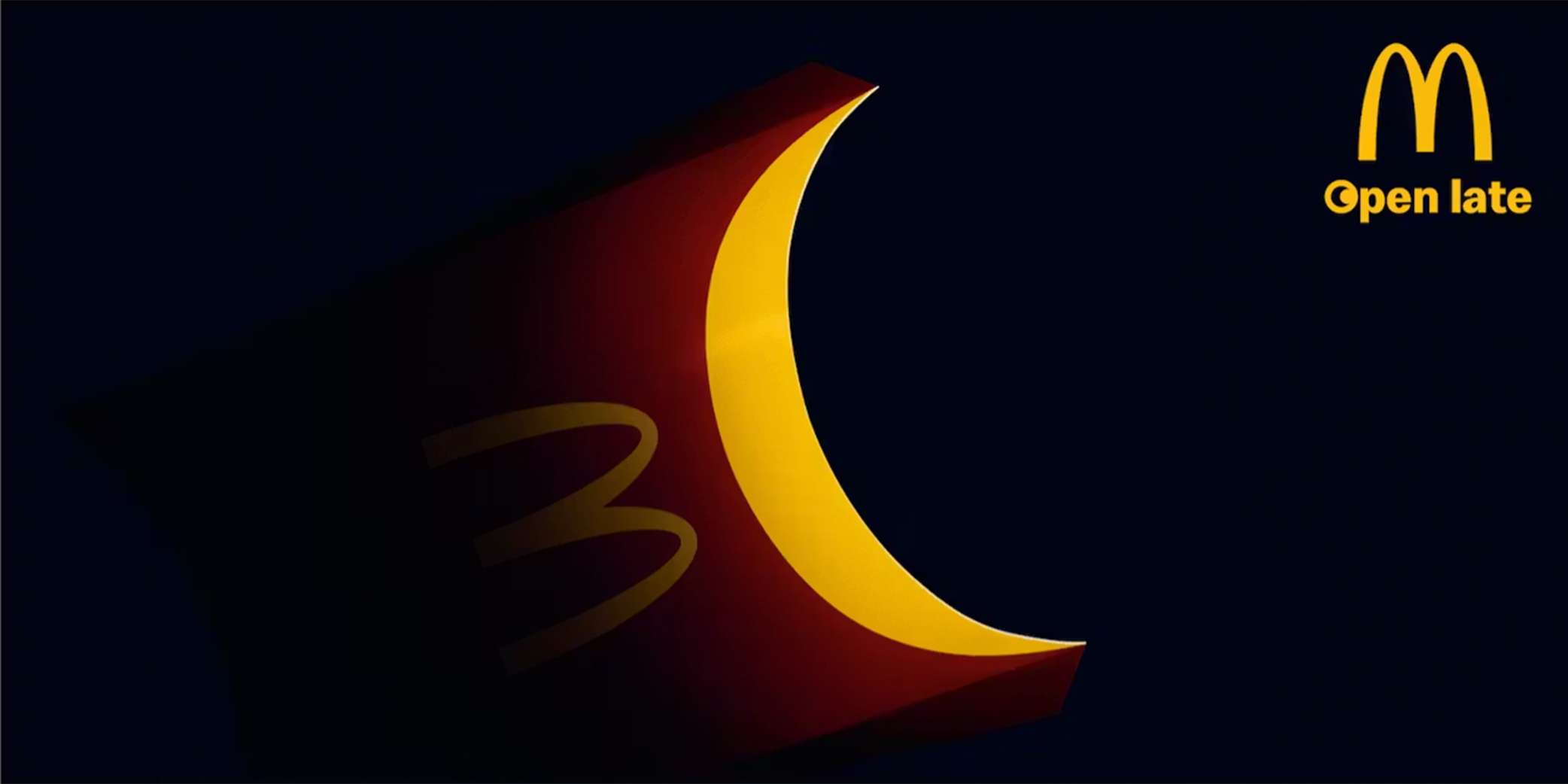
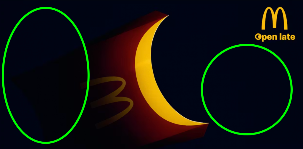
This visually striking advertisement for McDonalds, created by Leo Burnett, promotes their late-night service using a minimalistic design. This ad transforms a familiar product – the fries container – into a crescent moon, strengthening the “open late” message without relying on extensive text.
Alignment and Proximity
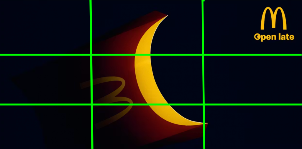
The crescent-shaped fries container is centrally positioned, acting as the primary focal point due to it’s size and brightness. Secondary alignment directs attention to the top-right corner, where the McDonald’s logo and the phrase “open late” are grouped. This placement shows both a centered and right alignment.
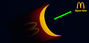
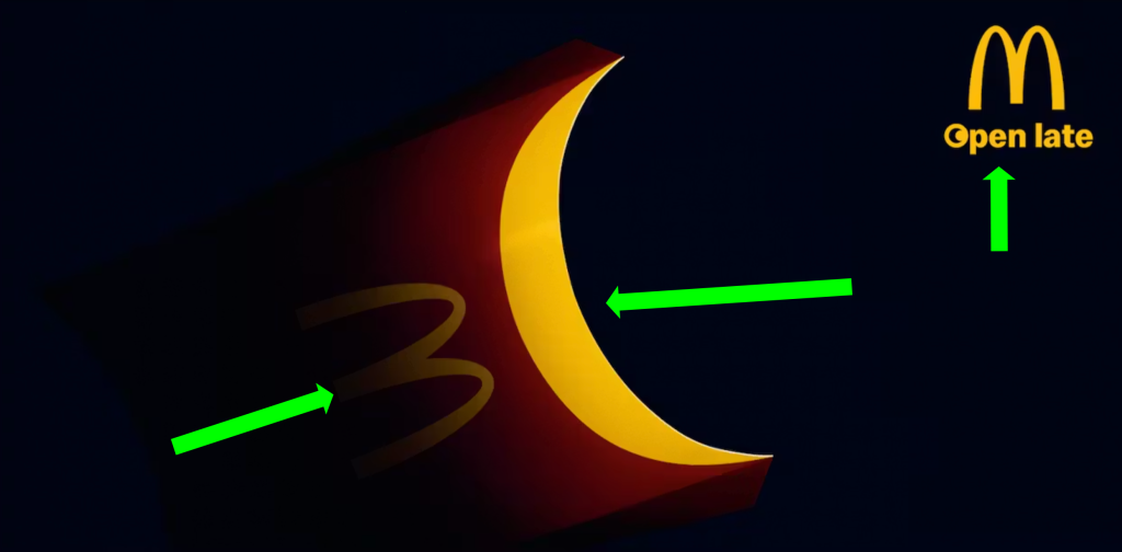
It also shows proximity of the logo with the main image, reinforcing that they function as a unified message. Meanwhile, the subtle placement of the “M” on the carton visually connects the product to the brand, encouraging viewers to associate the central image with McDonald’s without additional explanation.
Color and White Space
The ad uses a highly effective color palette built around contrast. The bold use of golden McDonalds-yellow against the deep black background, immediately captures the attention. The contrast not only enhances visibility but also reinforces brand recognition.
The good use of negative or white space is equally important. The dark, empty background isolates the central image, preventing distraction and allowing the viewer to focus entirely on the visual metaphor. This minimalism strengthens the message, demonstrating that the concept can be communicated without heavy reliance on text.
Font and Repetition
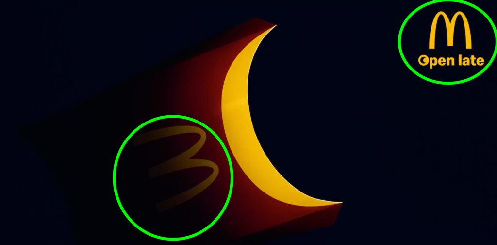
The consistent typography used here, reinforces the brand identity. The McDonald’s logo, including the iconic “M” appears both on the fry container and in the logo, creating a visual repetition that strengthens recognition. The “open late” text uses a clean, simple style that aligns with the brand’s established visual language, ensuring clarity. This consistency in typography allows viewers to quickly identify the advertisement as belonging to McDonald’s without needing additional explanation.
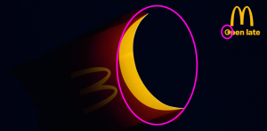
The design uses repetition through the crescent shape, which appears both as the central focal point of the fries container and within the “O” of the word “open”. This visual echo creates a direct connection between the image and the text, reinforcing the late-night theme. By repeating this curve, the designer guides the viewer to associate the moon-like shape with the message. This is a great example of how repetition reinforces the connection.
Conclusion
This advertisement successfully applies key principles of graphic design to effectively communicate it’s message. The simple design and message captures the attention and conveys meaning almost instantly.

Leave a Reply